EXECUTIVE CREATIVE DIRECTION

Design that makes people feel seen.

If it only works for the “average” user, it doesn’t work.

The Lens

The best design starts with understanding people, not defending our assumptions.

Every product, campaign, and experience quietly answers one question: Who did we design this for? My work lives in poking at that answer, translating complexity into clarity, and building experiences that help more people feel seen, understood, and powerful in the systems around them.

When we change the assumptions, we change who the world is built for.

Level Access

Accessibility doesn’t compromise impact.

A young woman with curly hair, glasses, and a black hoodie looking at her phone against a colorful purple and blue gradient background.
Digital illustration of a person with abstract icons around them representing data, connectivity, internet, and analytics on a gradient blue background.
Colorful purple background with white logo and text that reads 'Level Access'.
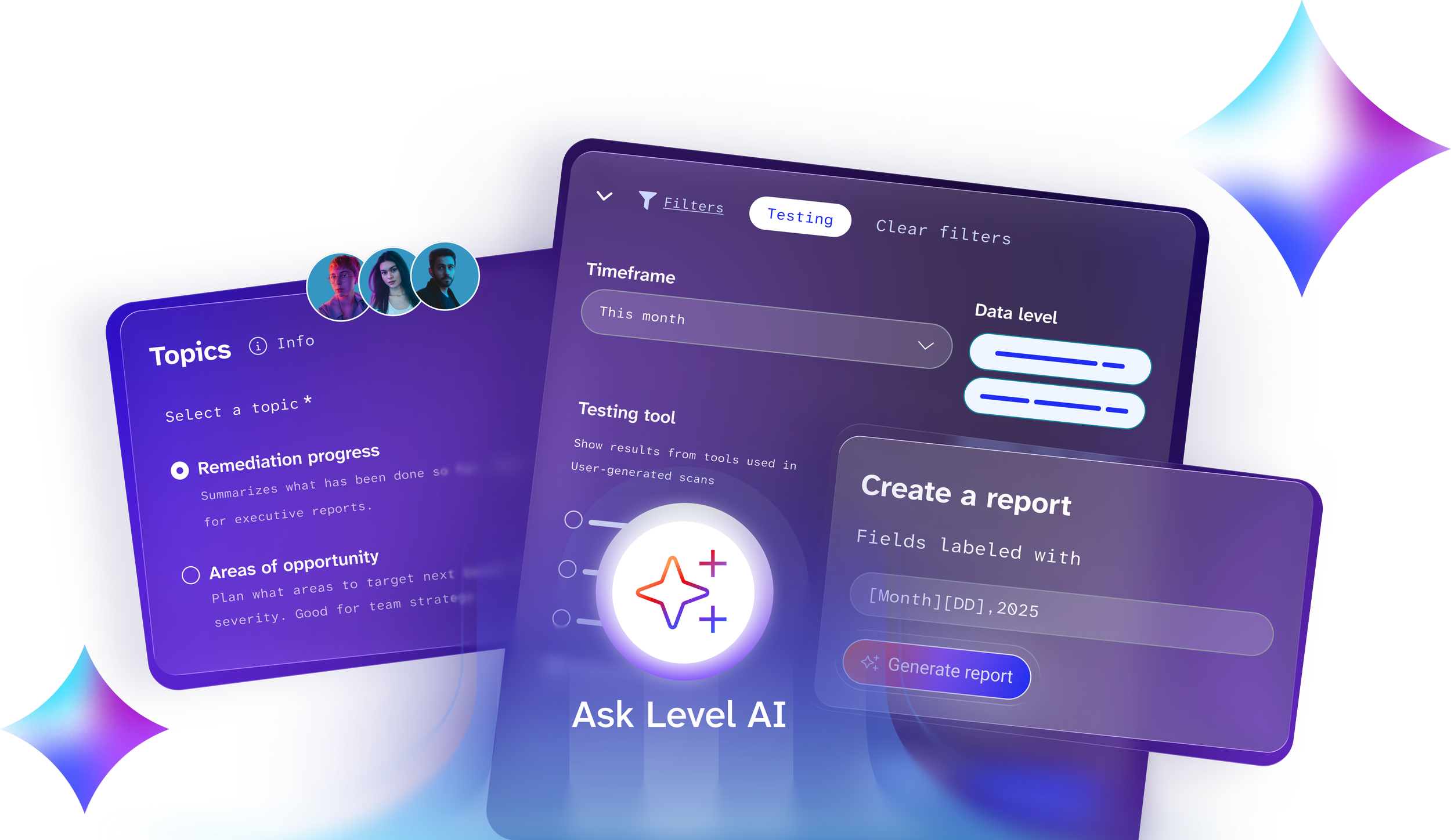
A digital user interface design with sections for filtering data, selecting topics, and generating reports, featuring colorful graphs, profile icons, and various interactive elements on a predominantly purple background.

Roger Publishing

Before it was expected.
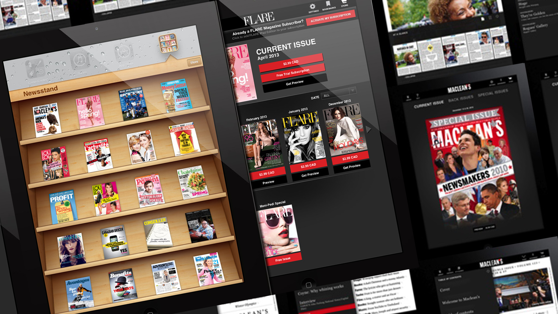
Multiple digital screens displaying various magazine covers and subscription options, including magazine titles like 'Maclean's', 'Hello Spring!', and 'Flare', with some screens showing magazine shelf displays.
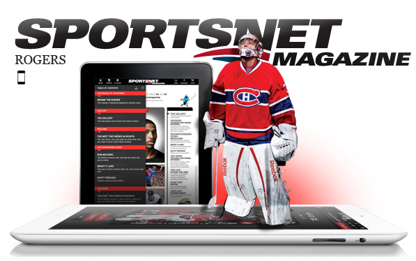
A sports magazine cover with the title SPORTSNET MAGAZINE, featuring a hockey goalie in a red and blue jersey standing in front of a large tablet displaying the sports news website.
Two iPads displaying news articles, with the text "Maclean's iPad App Rogers Goes Digital with Their Top News Publication" and the Rogers logo.

Coach

Legacy, made current.

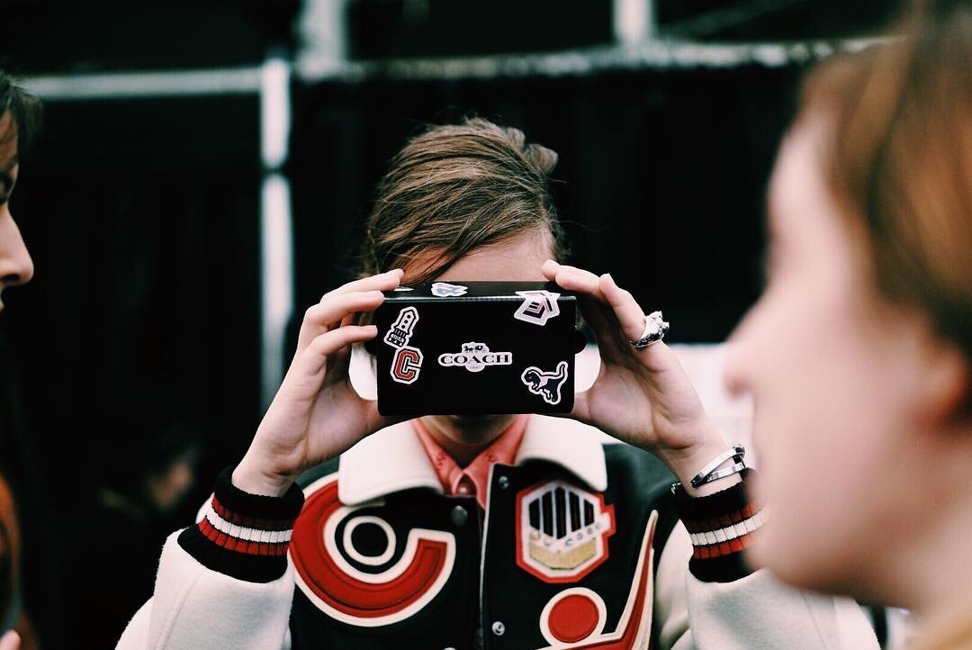
A person with light skin and brown hair is holding a mobile phone in front of their face, taking a photo or video. The person is wearing a varsity jacket with patches and red, black, and white stripes on the sleeves. Two other individuals are partially visible in the foreground and background.
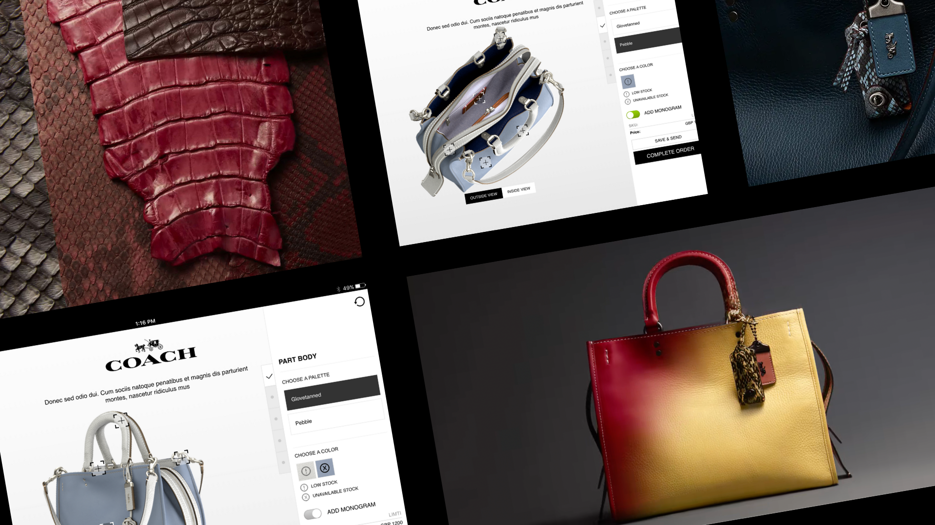
Collage of digital images showing designer handbags, including a red and yellow color block bag, a blue handbag on a product customization webpage, and close-up images of textured leather fabrics in red, brown, black, and snakeskin patterns.
iPhone displaying an online store page with Coach handbags and accessories, placed between a black and a yellow handbag.

Built Beyond the Default

Perspective only matters if it changes the work.

For over two decades, I’ve partnered with global brands to ship design that has to work in reality, not just in decks. Now I bring that same lens to the conversations shaping what’s next, helping organizations stop designing for imaginary “normal” people and start designing for the humans they’ve been overlooking.

Trusted by Microsoft, Samsung, Coach, Nike, Airbnb, Verizon, and more.